By Mitch Chadban — Designer, Marketer & SEO Specialist, Australia | Updated July 2026
The 12-Point Brand Consistency Checklist
This page is built as a practical brand consistency checklist, not a theory piece. Use it to audit what a prospect actually sees across your brand, decide what can be fixed quickly, and work out when the underlying problem is bigger than a few surface tweaks.
What brand consistency means
Brand consistency is not just using the same logo. It is the repeated use of the same core signals across every place a buyer encounters you.
- Visual signals: logo versions, colours, typography, spacing, imagery and layout patterns.
- Verbal signals: tone of voice, claims, positioning, service names and calls to action.
- Operational signals: templates, document formatting and approval habits that stop drift.
When those signals line up, the brand feels established. When they do not, the brand feels accidental, even if individual pieces look good on their own.
Why inconsistency costs trust
Inconsistency creates friction. A buyer lands on the site, clicks to social, opens a proposal or sees an ad, and each touchpoint feels like it came from a different business. That forces them to do extra interpretive work at exactly the point where trust should be getting easier.
In practice, inconsistency usually costs trust in three ways:
- Recognition drops: people do not build a clear memory of the brand.
- Credibility drops: the business looks less established or less careful.
- Conversion drops: mixed signals make it harder to believe the next step is safe.
This is why consistency is not cosmetic. It affects how well branding, content and SEO turn attention into enquiries.

The 12-point brand consistency checklist
Use this as a working checklist. Open your website, social profile, latest proposal, latest ad or sales asset, and your email signature side by side. Then go point by point.
1. Logo usage
What to check: Are you using the right logo version, size, spacing and colour treatment across website, social, documents and ads?
Why it matters: Inconsistent logo use makes the brand look unmanaged fast.
Quick fix: Standardise one primary logo, one reversed version and one icon version.
Bigger fix: Create a proper logo usage sheet and replace old files everywhere.
2. Colour system
What to check: Are the same brand colours used consistently, with clear roles for primary, secondary and accent colours?
Why it matters: Random colour use is one of the quickest ways to make the brand feel scattered.
Quick fix: Lock one primary, one support and one accent colour for immediate use.
Bigger fix: Build a colour system with usage rules for web, documents, social and paid assets.
3. Typography
What to check: Are fonts, weights and hierarchy consistent across headlines, body text, decks and documents?
Why it matters: Mixed typography makes even decent design feel unfinished.
Quick fix: Reduce to one or two font families and define headline/body roles.
Bigger fix: Set up a full type hierarchy across website, proposals and templates.
4. Image style
What to check: Do photos, illustrations and graphics feel like part of the same brand world?
Why it matters: Mixed image treatments break recognition and tone.
Quick fix: Choose one image style direction and stop using off-style assets.
Bigger fix: Create a visual brief covering photo treatment, cropping, tone and graphic overlays.
5. Layout and spacing
What to check: Do your pages, posts and documents use repeatable spacing and layout patterns?
Why it matters: Random spacing is subtle but strongly affects perceived quality.
Quick fix: Pick a small set of spacing rules and use them in every template.
Bigger fix: Build a layout system for key recurring brand surfaces.
6. Headline style
What to check: Do headlines follow a recognisable style, or does each channel sound like a different writer?
Why it matters: Headlines are often the first brand message a prospect reads.
Quick fix: Pick a preferred headline style: direct, benefit-led, plain English, or another clearly defined approach.
Bigger fix: Create messaging patterns for headline types across web, ads and documents.
7. Core positioning message
What to check: Are you describing what you do, for who, and why it matters in the same way everywhere?
Why it matters: Mixed positioning creates confusion, and confused buyers rarely convert.
Quick fix: Write one clear positioning sentence and reuse it everywhere for 30–90 days.
Bigger fix: Clarify the brand message architecture and align homepage, bios, ads and proposals to it.
8. Tone of voice
What to check: Does the brand sound like the same business across site copy, social captions, emails and proposals?
Why it matters: Tone drift makes the brand feel unstable or performative.
Quick fix: Define five phrases you use and five you avoid.
Bigger fix: Turn tone into a working voice guide with real examples by channel.
9. Calls to action
What to check: Are your main CTAs named consistently across touchpoints?
Why it matters: Repeated CTA language makes the next step feel more familiar and lower risk.
Quick fix: Choose one main CTA and update the obvious mismatches first.
Bigger fix: Create a CTA framework linked to specific stages and offers.
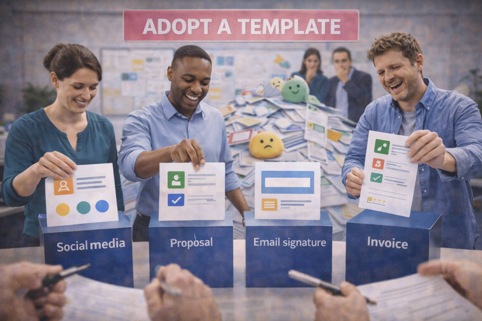
10. Social and content templates
What to check: Are recurring posts built from templates, or is every asset recreated from scratch?
Why it matters: No templates means drift is inevitable as output grows.
Quick fix: Build one or two post templates for your highest-frequency formats.
Bigger fix: Build a reusable content kit that works with your workflow and tools.
11. Sales documents and proposals
What to check: Do proposals, decks, invoices and other documents feel consistent with the website and outward-facing brand?
Why it matters: A strong site followed by a weak proposal is a trust leak.
Quick fix: Update your most-used proposal or quote template first.
Bigger fix: Roll out a consistent document suite across sales and delivery touchpoints.
12. Quality control
What to check: Is there a simple review process before anything publishes?
Why it matters: Even good rules fail if nobody checks them in practice.
Quick fix: Use a short pre-publish checklist for logo, colours, message and CTA.
Bigger fix: Create a lightweight brand QA routine the team actually follows.
How to audit website consistency
The website is usually the clearest place to spot inconsistency because multiple brand signals sit together in one environment.
- Check whether the homepage, service pages and contact page feel visually aligned.
- Check whether headlines, button styles and trust signals follow the same logic.
- Check whether the core positioning message stays stable from page to page.
- Check whether the contact path feels like the same brand promised earlier on the page.
If the website already feels uneven, it is worth reviewing whether the issue starts upstream with the identity itself. Pages like Logo Design Cost in Australia: What You Actually Get help clarify whether the underlying issue is a shallow logo-only setup rather than execution alone.
How to audit social and content consistency
Social inconsistency often shows up as a mix of different colours, fonts, layouts, tones and content promises.
- Pull your last 9–12 posts into a grid and look for visual drift.
- Read captions back to back and check whether the voice stays recognisable.
- Check whether your graphics feel built from the same system or from random templates.
- Check whether social claims line up with what the website actually promises.
If the issue is partly tool-driven, Canva vs Designer is the practical follow-up because the problem is often not Canva itself, but using Canva without a system.
How to audit documents, proposals, ads and customer touchpoints
This is where many businesses lose consistency without noticing. The external brand may look fine, but the conversion and delivery layer feels disconnected.
- Open your latest proposal, quote, invoice, ad creative and email signature side by side.
- Check whether they use the same colours, typography, headline style and CTA language.
- Check whether your offers are named consistently.
- Check whether proofs, case studies and contact prompts feel like part of the same brand system.
If you need a wider audit of what branded assets should even exist, see The Marketing Collateral Checklist. For portfolio-level examples of more consistent brand application, see Paragon BM, Kryoz Gardening and Various Posters.
When to fix it yourself vs get help
Fix it yourself if the issue is mostly execution drift: inconsistent CTA wording, outdated files, weak templates, or teams using too many colours and fonts.
Get help if the issue is more structural:
- the brand message is unclear
- the identity was never properly systemised
- multiple channels are drifting at once
- the website, content and brand now need to work together commercially
That is usually the point where a few edits stop being enough and a proper brand system or brand + SEO review makes more sense.
Need a brand system review?
If your brand looks inconsistent across the website, social, documents and sales material, I can help identify whether you need a simple clean-up, a stronger template system, or a broader brand and SEO review.
The goal is not a prettier PDF. The goal is a brand that looks more trustworthy, is easier to run, and supports conversion properly.
FAQ: Brand consistency checklist
What is brand consistency?
Brand consistency means the business presents the same key signals across customer touchpoints: visually, verbally and operationally. It is what makes the brand feel recognisable and dependable rather than improvised.
Why does inconsistency cost trust?
Because mixed signals create friction. Buyers have to work harder to understand who you are, what you offer and whether the business feels reliable.
How often should I run a brand consistency audit?
Quarterly is a sensible baseline for most small businesses, and also any time the website, offers, channels or team setup changes meaningfully.
Can I fix brand consistency without a full rebrand?
Yes. Many businesses do not need a full rebrand. They need better message discipline, cleaner visual rules and templates that make consistency easier.
When is it worth getting outside help?
When the issue is not just execution drift but a deeper system problem: unclear positioning, incomplete identity, multi-channel inconsistency or weak commercial alignment between brand and website.